Plotting Distance vs. Time with Motion Sensors
When my students were learning about Distance vs. Time plots, I planned a kinesthetic activity, inspired by an exhibit at the Museum of Science in Boston, to give my students an additional entry point to learning the material. Students had to demonstrate their understanding of the topic by replicating distance vs. time plots by using sonar sensors and software, LabPro, to collect and graph data.
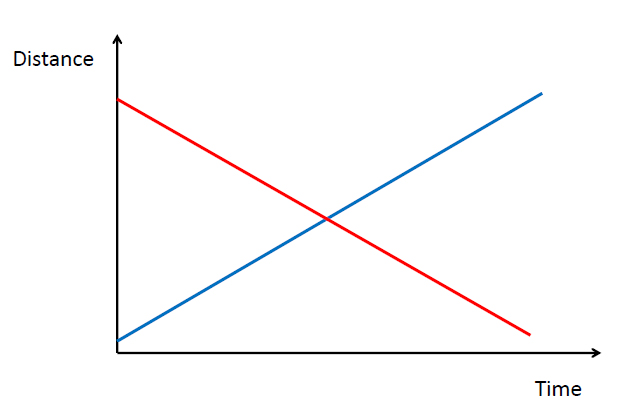
I grouped the class into two sections. The groups were assigned to a color, red or blue, and volunteers from each group would replicate the following plots I had made using the motion sensors. The groups worked together to figure out how their respective volunteers had to move.
Below are the plots they had to replicate:
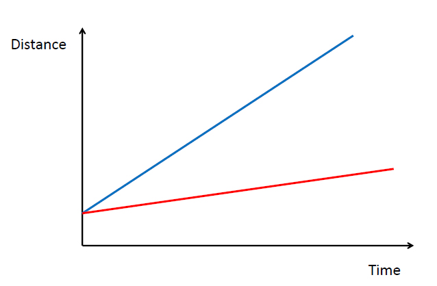
|
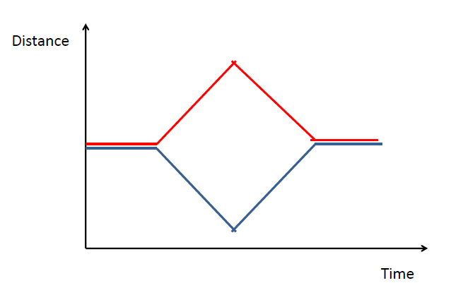
|
All the classes actively participated in the activity. I found the lesson flexible in terms of allowing for different student dynamics. Some classes were turned the activity into a competition, where in others classes, the activity was one of polite discourse. I also felt that the the students were comfortable experimenting and gaining a better sense of what Distance vs. Time plots really measured as they would ask to re-try making the graphs multiple times.
Click Here to go back to Sample Lessons.
Click Here to go back to Sample Lessons.
